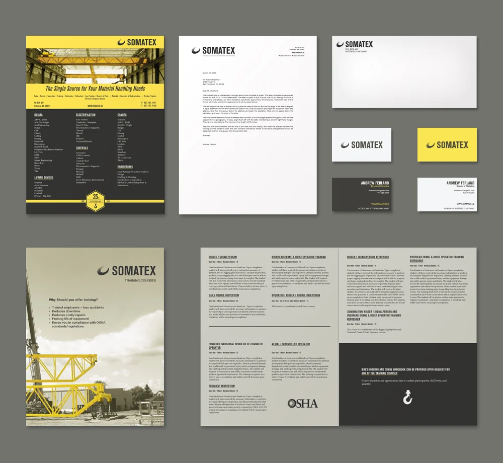


The Somatex rebranding first changed the logo to make it simple and bold. The design stripped away the previous ornaments and extra text in order to make room for simplicity and modernism. The logo was redone in three colors to make the logo mark and the text pop from a dark background. A gradient was used to further emphasize the image of a hoist, which was previously portrayed as a solid color. The new color scheme and mark treatment ties the whole branding together, bringing yellow and grey together to make a unified aesthetic approach. These designs were set across multiple mediums, like the website, brochures, and stationery.
The Somatex rebranding first changed the logo to make it simple and bold. The design stripped away the previous ornaments and extra text in order to make room for simplicity and modernism. The logo was redone in three colors to make the logo mark and the text pop from a dark background. A gradient was used to further emphasize the image of a hoist, which was previously portrayed as a solid color. The new color scheme and mark treatment ties the whole branding together, bringing yellow and grey together to make a unified aesthetic approach. These designs were set across multiple mediums, like the website, brochures, and stationery.
L / 2013 logo | R / 2014 logo
WEBSITE ICONS
andrewfrlnd@gmail.com